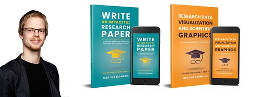
A new book shows young scientists how to visualize their research


A new book shows scientists how to turn data into efficient charts and visually demonstrate their research ideas. Although these are tasks that researchers perform routinely, rarely anyone has been trained to do it. The book “Research Data Visualization and Scientific Graphics: for Papers, Presentations and Proposals” offers an eight-step system that will allow anyone to improve their dataviz skills. 


“More effective figures might just be the little push that gets your papers accepted in top journals, your proposals funded, and your conference presentations remembered”, says Martins Zaumanis. 

Since the author is one of the SaferUP! supervisors, many examples in the book will feel familiar to the SaferUP! family. 

This is already the second book in the “Peer Recognized” series. The first one, titled “Write an Impactful Research Paper” was published just months ago and it offers a system for becoming efficient at writing research papers using a method called LEAP. The book also reveals eight unwritten rules that any young scientist with aspirations for a tenure track position should follow. 

“But here is a secret”, Martins says, “I also have created a website, which is an extension of the books, offering many productivity-boosting tools for scientists.”

What does he mean? Here is an article that shows how to select journals to publish in: https://peerrecognized.com/journals/

And here is one offering tools for creating scientific illustrations: https://peerrecognized.com/graphics/

But perhaps it is best to start by finding out how a scientist is judged? Martins explains it here: 

https://peerrecognized.com/measuring-academic-success-of-a-scientist/