- Home
- SUMMARY
- BY TEXTBOOK Apri sottomenù
-
BY TOPIC
Apri sottomenù
- S1 : Greenhouse effect
- S2 : Anthropogenic cause
- S3 : Future scenarios of temperature increases
- S4 : Impacts on Earth’s systems
- S5 : Impacts on economic and social systems
- E1 : Mitigation as a social dilemma
- E2 : Carbon pricing
- E3 : Discounting in reference to climate change
- E4 : Inequality in reference to climate change
- E5 : Social Cost of Carbon and IAMs
- E6 : Persistency & irreversibility in reference to climate change
- E7 : Climate decision-making under uncertainty
- E8 : Climate policies
- E9 : Behavioural issues in reference to climate change
- E10 : Adaptation and geoengineering
- SAMPLE LECTURE
- ABOUT US
E4 : Inequality in reference to climate change
Any statement about inequality related to GHG emissions or vulnerability and damage will be recorded under this section.
US-4-m
196-197
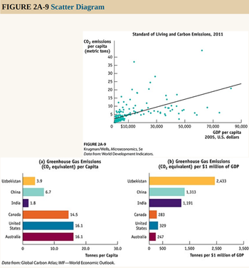
Figure 2A-9 is an example of a different kind of numerical graph. It represents information from a sample of 186 countries on the standard of living, again measured by GDP per capita, and the amount of carbon emissions per capita, a measure of environmental pollution. Each point here indicates an average resident’s standard of living and his or her annual carbon emissions for a given country.
The points lying in the upper right of the graph, which show combinations of a high standard of living and high carbon emissions, represent economically advanced countries such as the United States. (The country with the highest carbon emissions, at the top of the graph, is Qatar.) Points lying in the bottom left of the graph, which show combinations of a low standard of living and low carbon emissions, represent economically less advanced countries such as Afghanistan and Sierra Leone. The pattern of points indicates that there is a positive relationship between living standard and carbon emissions per capita: on the whole, people create more pollution in countries with a higher standard of living.
1036-1037-1038
At first glance, a comparison of the per capita greenhouse gas emissions of various countries, shown in panel (a) of this graph, suggests that Australia, Canada, and the United States are the worst offenders. The average American is responsible for 16.1 tonnes of greenhouse gas emissions (measured in carbon dioxide, CO2 , equivalents)—the pollution that causes climate change—compared to only 3.9 tonnes for the average Uzbek, 6.7 tonnes for the average Chinese, and 1.8 tonnes for the average Indian. (A tonne, also called a metric ton, equals 1.10 ton.)
Such a conclusion, however, ignores an important factor in determining the level of a country’s greenhouse gas emissions: its gross domestic product, or GDP—the total value of a country’s domestic output. Output typically cannot be produced without more energy, and more energy usage typically results in more pollution. In fact, some have argued that criticizing a country’s level of greenhouse gases without taking account of its level of economic development is misguided. It would be equivalent to faulting a country for being at a more advanced stage of economic development. A more meaningful way to compare pollution across countries is to measure emissions per $1 million of a country’s GDP, as shown in panel (b). On this basis, the United States, Canada, and Australia are now “green” countries, but China, India, and Uzbekistan are not. What explains the reversal once GDP is accounted for? The answer is scarce resources. Countries that are poor, such as Uzbekistan and India (and, historically, China), have viewed resources spent on pollution reduction as better spent on other things. They have argued that they are too poor to afford the same environmental priorities as wealthy advanced countries. To impose a wealthy country’s environmental standards on them would, they claimed, jeopardize their economic growth. However, the scientific evidence pointing to greenhouse gases as the cause of climate change and the falling price of non-polluting energy sources has changed attitudes in poorer countries. Realizing that their citizens are likely to suffer disproportionately more from climate change, poor countries joined forces with rich countries to sign the Paris Agreement in 2015, an agreement between 196 countries to limit their greenhouse gas emissions in order to avoid the adverse effects of climate change.
US-6-m
48
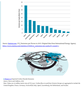
Per-capita carbon dioxide emissions vary significantly across countries. In general, emissions per capita rise with higher incomes, but this is not always the case. The highest per-capita emissions are found in oil-producing countries. Emissions per capita are quite high in the United States, at around 16 tons. Per-capita emissions are about 9 tons in Germany, 7 tons in China, and 4 tons in Mexico. Per-capita carbon dioxide emissions are much lower in the worlds poorest countries.
195
In considering the impacts of carbon dioxide, it doesn’t matter where it is emitted, as CO2 is a global pollutant that contributes the same amount to climate change regardless of its country of origin. But the distinction is important when we want to trade each country’s responsibility for CO2 emissions. In other words, who is responsible for CO2 emissions—the country that directly emits it or the country that ultimately consumes the products associated with the emissions?
Scientists have estimated the trade flows of CO2 emissions “embodied” in trade, shown in Figure 6.3. Countries colored in blue are responsible for less pollution than official statistics indicate when we account for exported emissions. The dark gray areas (the United States, Europe, and Japan) are responsible for more emissions than official statistics indicate when we account for exported pollution. We see that the largest flow is from China to the United States, meaning that about 400 million tons of CO2 emitted in China each year is a result of demand in the United States for Chinese imports. The second-largest flow is from China to Europe. Flows from the Middle East mostly reflect the demand for oil imports.
319
One also sees considerable inequality when confronting the issue of climate change. Numerous studies find that climate change will hit poor countries the hardest, exacerbating global inequality. Warmer temperatures and changing precipitation patterns in Africa and other developing regions could reduce the growing season and lower yields, leading to a 20 percent global increase in the number of people at risk of hunger by 2050. According to a 2015 analysis in the journal Nature, by the end of the twenty-first century climate change will have a significantly higher proportionate impact on incomes in the world’s poorest countries. In addition to these specific effects, a critical fact about climate change, as well as other environmental damage, is that the rich can generally protect themselves much better than the poor can.
425
Even further, climate change raises important questions about fairness between rich and poor countries.
[...]
Another study estimated that 400,000 deaths in 2010 were attributable to climate change, primarily as a result of malnutrition and disease, with over 80 percent of those deaths in developing countries.
426
We see that virtually all the increase in emissions in the coming decades will be a result of higher emissions in developing countries (i.e., those that are not members of the OECD). Most of the carbon emitted from human activities to date, however, has come from developed countries.
Further, CO2 emissions per capita are much higher in developed countries and will continue to be so for the foreseeable future. For example, annual emissions per capita are currently about 16 tons in the United States, 9 tons in Germany, 7 tons in China, 1.4 tons in India, and 0.3 tons in Kenya. This disparity in emissions per capita roughly reflects the global disparity in income. Thus simply requiring all countries, say, to reduce emissions by 50 percent would reinforce current global income inequalities by limiting the development options available to developing countries.
427
As atmospheric concentrations of greenhouse gases increase, the world is expected to become warmer, on average. Not all regions will warm equally, and some regions may actually become cooler. Warmer average temperatures increase evaporation, which in turn leads to more frequent precipitation, but again all regions will not be affected equally. In general, areas that are already wet will become wetter and dry areas will become drier.
The negative impacts of climate change will fall disproportionately on developing countries. Warming above 4 degrees Celsius is considered particularly dangerous to poorer nations, with the IPCC estimating that this would result in a high risk of reduction in fresh water availability and food supplies, along with a spread in diseases and an increase in heat-related mortality.
US-8-m
799
However, the course of action needed to address climate change deals with equity issues that are difficult on which to achieve consensus.
802
The IPCC summarizes the consequences of climate change by listing five key "reasons for concern" as follows:
1. Distribution of impacts: The risks of climate change on disadvantaged people and communities are greater, especially those that depend on agricultural production.
813
Equity issues arise when some countries pay significantly more to reduce global climate change than other countries .
US-10-m
237
This negative externality [GhG emissions] is caused by some but borne jointly by everyone. Because large CO2, emitters consider only the internal costs of their actions and ignore the social costs, the amount of CO2, released, and the corresponding increase in global warming, is larger than optimal. The air, a common resource, is being "overused" and degraded.
US-16-m
7-8
It is also the case that richer countries have, on average, higher emissions per capita. We explore this link between income and emissions, and consider whether it will be possible, in future, to raise living standards around the world without further damage to the climate.
91
Carbon plus capitalism has brought unprecedented increases in material well being to billions, but most of the people of the world remain poor by the standards of the higher income countries. Climate change induced by burning carbon means that an ongoing reduction in global poverty cannot be accomplished by the same carbon plus capitalism that accounted for rising income in the now-rich countries.
93
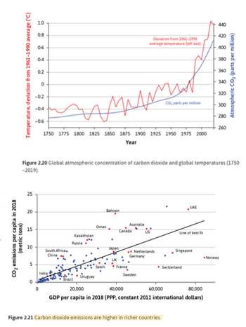
Figure 2.21 shows the link between rising living standards and CO2 emissions: countries where GDP per capita is higher tend to have higher CO2 emissions as well. This is to be expected because greater income per capita is the result of a higher level of production of goods and services per capita, involving greater use of fossil fuels. The upward- sloping ‘line of best fit’ shows the average emissions per capita for each level of GDP per capita. Low emissions by low-income countries signal energy poverty, not green energy or energy conservation.
93-94
But even among countries with similar per capita income, some emit much more than others. Compare the high emissions in the US, Canada, and Australia with the lower levels in France, Sweden, and Germany. Norway and Switzerland both have higher per capita incomes than the US but emit half as much CO2.
94
This suggests that it is possible to organize production to offset, in part, the tendency for increased emissions as income rises. In low-emitting countries like France and Sweden, a substantial share of electricity is generated by non-fossil fuel sources (92% and 99% respectively) and petrol prices are much higher than in the countries with high emissions like the US and South Africa (above the line). For the poor countries on the left of the figure, their move to higher incomes needs to be a more nearly horizontal one rather than along the ‘line of best fit’.
266
When greenhouse gases or pollutants degrade an environment, some people suffer more than others, depending on their location and income, while some benefit from the economic activity that causes the damage.
US-2-M
118-119
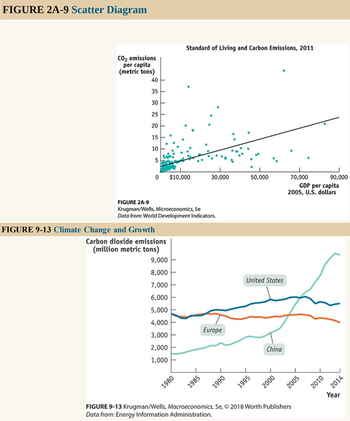
Figure 2A-9 is an example of a different kind of numerical graph. It represents information from a sample of 186 countries on the standard of living, again measured by GDP per capita, and the amount of carbon emissions per capita, a measure of environmental pollution. Each point here indicates an average resident’s standard of living and his or her annual carbon emissions for a given country. The points lying in the upper right of the graph, which show combinations of a high standard of living and high carbon emissions, represent economically advanced countries such as the United States. (The country with the highest carbon emissions, at the top of the graph, is Qatar.) Points lying in the bottom left of the graph, which show combinations of a low standard of living and low carbon emissions, represent economically less advanced countries such as Afghanistan and Sierra Leone. The pattern of points indicates that there is a positive relationship between living standard and carbon emissions per capita: on the whole, people create more pollution in countries with a higher standard of living.
344-345
A recent estimate put the cost of unmitigated climate change at 20% of world gross domestic product by 2100. Moreover, these costs tend to fall more heavily on poor countries. The problem of climate change is linked to economic growth: the larger the economy, the more homes, factories, and vehicles, will have to be powered, typically by burning fossil fuels.
345
To reduce the global emission of greenhouse gases, developed countries and large rapidly developing countries, such as China and India, will have to undertake a transition from a heavy reliance on fossil fuels to greater use of clean, renewable energy sources such as wind and solar power. We refer to this process as the great energy transition. Until recently, effective action against climate change had been stymied by disagreement among countries on how to pay the cost of shifting from fossil fuel to clean energy sources. As Figure 9-13 shows, today’s wealthy economies have historically been responsible for most of the carbon dioxide emissions—and carbon dioxide alone accounts for almost 76% of all global greenhouse gas emissions. But newly emerging economies like China and India are responsible for the recent growth. Inevitably, rich countries are reluctant to pay the price of reducing emissions only to have their efforts frustrated by rapidly growing emissions from new players. But relatively poor countries like China and India consider it unfair that they should be expected to bear the burden of protecting an environment threatened by the past actions of rich nations.
347
The international burden sharing of greenhouse gas emissions reduction is contentious because rich countries are reluctant to pay the costs of reducing their emissions only to see newly emerging countries like China rapidly increase their emissions. Yet most of the current accumulation of gases is due to the past actions of rich countries. Poorer countries like China are equally reluctant to sacrifice their growth to pay for the past actions of rich countries.
FR-4-M
309
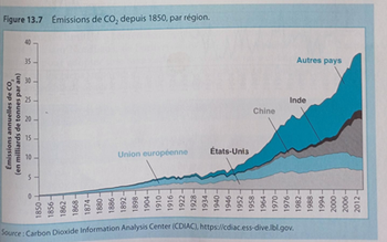
La figure 13.7 présente l'évolution des émissions de CO2, depuis 1950, par région du monde. Elle montre que les émissions ont très fortement augmenté avec le temps, d'abord en Europe pendant la Révolution industrielle, les États-Unis devenant ensuite le principal émetteur. Depuis les années 2000, cependant, les émissions de la Chine ont dépassé elles de l'Europe et des États-Unis combinées.
311
Dans la mesure où, au sein de chaque pays, les ménages les plus pauvres ont en moyenne des voitures plus anciennes et qui produisent pour cette raison plus d'émissions de CO2, les politiques de lutte contre ces émissions sont régressives, sauf à être compensées par une redistribution adaptée.
[...]
Les négociations internationales sur le climat sont source de tensions importantes entre les marchés émergents et les économies avancées. [...] La Chine est désormais le principal émetteur de CO2, et serait donc le pays le plus impacté par la fixation d'un prix sur ces émissions. La Chine avance cependant l'argument que l'Europe et les États-Unis ont pu se développer et émettre du CO2 sans payer de coût, et qu'il serait injuste de demander à la Chine de le faire pour ses propres émissions.
FR-7-M
157
Cependant, la question du respect des critères du développement durable est régulièrement un point de discorde entre pays riches et pays en développement. Ces derniers critiquent en effet ces nouvelles normes s'imposant à eux, pouvant réduire leurs perspectives développement, alors que celles-ci n'étaient pas présentes durant l'industrialisation des pays développés. Les critiques du Brésil face aux réactions à la déforestation de l'Amazonie en sont un exemple frappant, tant cette zone est vitale à l'ensemble de l'humanité en même temps que l'agriculture est importante dans le modèle économique Brésilien.
Cette situation appelle alors à la solidarité des pays du Nord, qui se sont engagés à verser plus de 100 milliards de dollars par an à partir de 2020 pour aider au développement des pays pauvres en accord avec les respects du développement durable à travers le Fonds vert pour le climat, le fonds d'adaptation et des aides publiques au développement. De nombreux pays comme l'Allemagne ou la Norvège, à travers son fonds de pension, s'engagent ainsi à soutenir les économies en développement en échange de politiques volontaristes en matière de protection de l'environnement.
FR-2-B
149-150
Les pays en développement sont réticents à agir, arguant le fait que les pays anciennement industrialisés ont une « dette écologique » puisque les 4/5 des GES accumulés dans l'atmosphère sont le legs de leur développement économique depuis la révolution industrielle. Les pays non développés ont beau jeu de les renvoyer à leur responsabilité passée et de refuser de porter un poids que les pays développés n'ont pas eu à subir au cours de leur propre histoire. D'autant plus qu'ils soupçonnent que le Nord utilise le prétexte environnemental pour pratiquer un protectionnisme déguisé vis-à-vis d'eux.
FR-4-B
472
Enfin, les déplacés climatiques résultent d'une vulnérabilité environnementale accrue en particulier dans les zones équatoriales, plus touchées par les événements climatiques extrêmes: Afrique subsaharienne, Asie du Sud et Amérique Latine. La Banque mondiale, dans le rapport intitulé Groundswell: Se préparer aux migrations climatiques internes (2018) estime que d'ici à 2050, 140 millions de personnes pourraient être contraintes de se déplacer.
491
Selon le Rapport sur le développement humain (2020), les inégalités d'émissions carbone sont criantes : les 1 % les plus riches de la planète émettent 100 fois plus de dioxyde de carbone que les 50 % les plus pauvres.
497
Or, plusieurs obstacles se dressent contre cette coopération. Les émergents jugent les pays avancés responsables du stock de CO2, émis depuis la Révolution industrielle. Ils sont en revanche les premiers émetteurs de CO2, actuellement. Il y a alors reconnaissance d'une responsabilité commune, mais différenciée qui impose aux pays avancés de montrer la voie vers une croissance plus respectueuse de l'environnement. Le cadre onsien est ainsi pour certains économistes de moins en moins adapté aux négociations climatiques car il implique trop de parties prenantes aux intérêts divergents.
IN-2-M
46
In this regard some western economists have pointed out that some developing countries in their attempt to speed up economic growth and raising their GDP as rapidly as possible have overexploited the natural resources and caused a good deal of environment pollution and natural resources degradation. […]
However, in our view this is not entirely correct to blame the developing countries who want higher GDP growth rate to reduce poverty in their countries. As a matter of fact, it is the developed countries who in the past for achieving rapid industrial growth have contributed a lot to the emission of harmful gases such as carbon dioxide that have significantly contributed to the global warming affecting the welfare of the people of developing countries.